Kritter Catchers
Overview
Killian and Claire needed a website and a logo for their company, Kritter Catchers in Nutely, NJ. They wanted a logo that was playful, yet professional and a website that was attractive but straightforward for users.
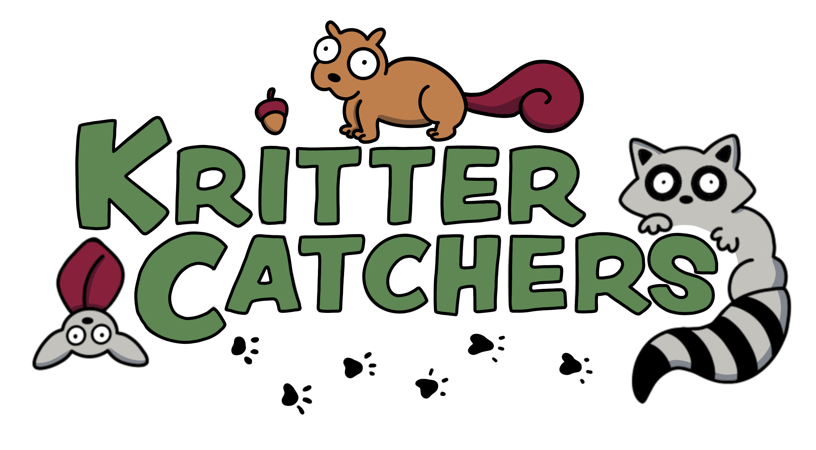
The Logo
I knew Killian and Claire were fans of my illustrations, so I wanted to include some of that in the logo. The font needed to compliment that, so I needed something sketch-like but still readable. After finalizing the logo, I incorported some of its' elements into the website wireframe.


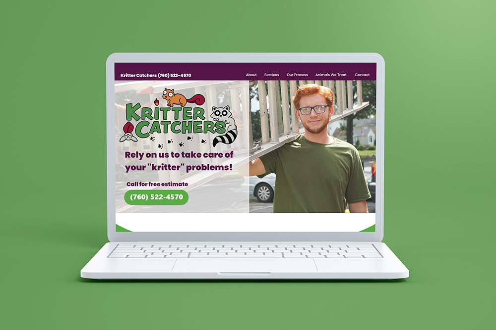
The Website
I was researching how competitors designed their websites and noticed how almost all the information was one just one page. There were also many opportunities for the user to click on the number to call. I liked this idea, because I imagine if you're looking up a pest control company, you're mainly looking to call someone to help you.
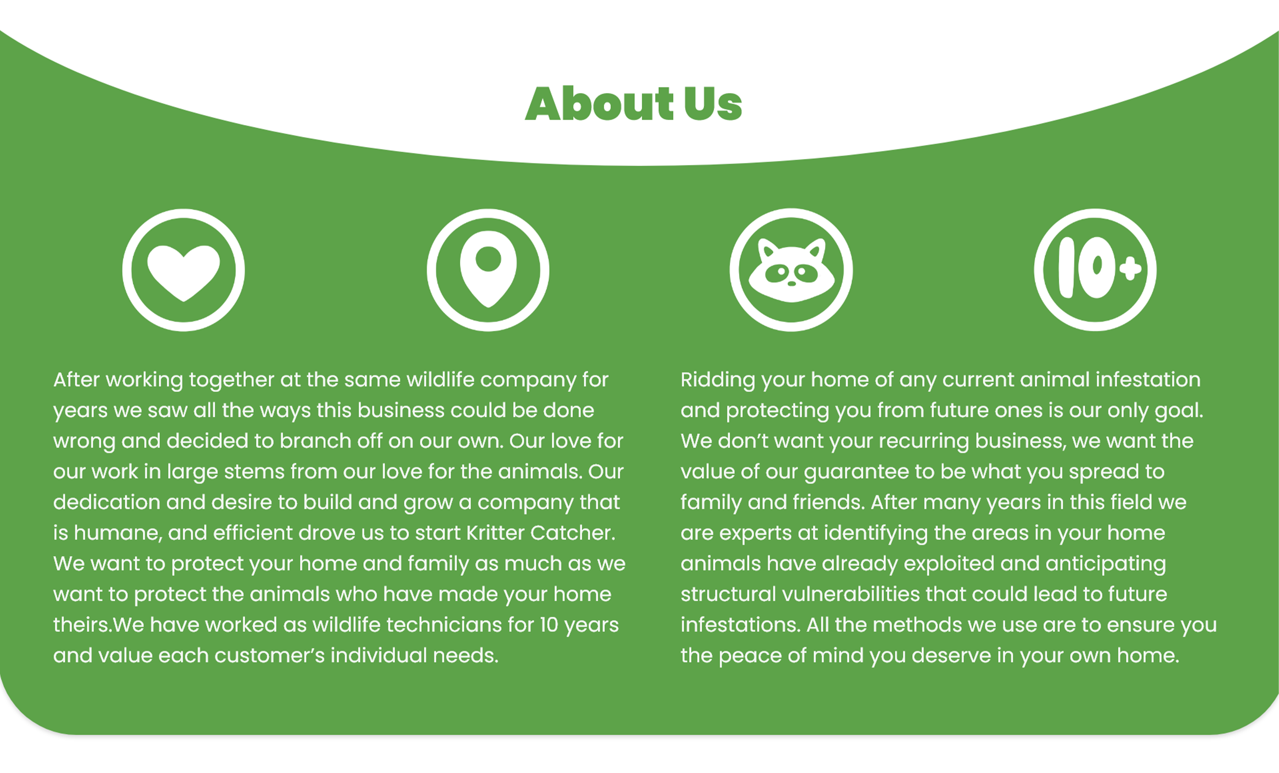
I stuck with a one page layout for the website and broke it into sections. From there I wanted to make the experience straightforward for the users, so it's easy to figure out what Kritter Catchers does and how to contact them. To do this, I made the design simple without any wild embellishments. I wanted the information to stand on it's own.


A challenge was keeping the website light and playful while the subject of the website can be a little...well, gross. I noticed that other pest control businesses would have picutres of actual dead animals on their websites. As a user, that gave me the heebie jeebies. Since Kritter Catchers is a humane business I wanted to show a more humane outlook. By using a friendly tone and pictures of LIVE animals, I think I accomplished my goal.
